From what I know at least. After reading this great post by Ilithya. I figured I’d put together what I know about CSS art in one place. There are probably better people to do this, but it may as well start somewhere. Feel free to correct any inaccuracies, CSS is a tool rather than a lifestyle for me.
CSS Art Timeline
0. CSS
You can follow Håkon Wium Lie, the guy who invented CSS/proposed the spec. It’s amazing that you even can & you should, he proposed CSS. Tim too. ZenGarden + others started it in many ways. A mention goes out to the anons & people who do stuff without credit too.

1. Stu Nicholls
Makes CSS Pixel art demos in {pre} 2006. For context, Chris/Vitaly launch (+ grow) CSS Tricks & Smashing Magazine around the same time. All SEOs are WordPress publishing like madmen for that Eternal September traffic. A landgrab for SERPs/blogrolls, links & traffic spiking. FB is two years old, Youtube is 1.
CSS Art by Stu Nicholls was way ahead of the game. The next time we would see CSS art as realistic as Freddie is The Mona Lisa machine-gen pixel art on Codepen.

2. Roman Cortes
In July 2006, Roman Cortes made this owl logo which puts him close to Stu’s work (recorded as pre-2006).
Roman makes Homer in 2008. This is the first CSS art/cartoon that is not pixel I guess. Do you know how long it took him? I do. This is a full 4 years before I considered doing CSS art.
Homer is a slightly different to the current techniques, it is “Verdana font characters positioned in the right places & sizes to make the image.” – Quote from Roman himself. More info.

Roman Cortes makes a “Pure CSS Coke Can” in 2010. It’s not pure CSS, but it’s amazing. @romancortes is another one people are sleeping on, but he just woke up.
The Simpson’s CSS art is it’s own sub-genre already. As are many characters (cartoon characters are easier in CSS when compared to specular lighting or refraction). The search is unreliable, but you can see a bunch here.
3. Steve Dennis
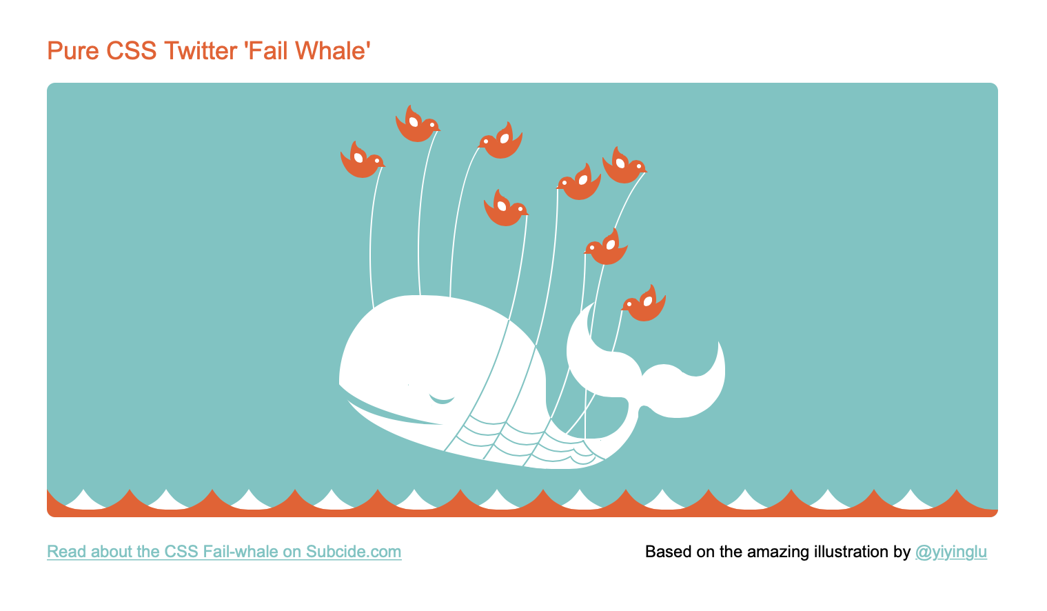
Steve Dennis makes an animated Twitter Fail Whale in 2010. Very early, probably the first CSS animated scene.
Various
Someone makes flat b&w stormtrooper & darth (link anyone?). Someone else makes a train. A keyboard I think. All of these are amazing, they are more CSS to art, than art to CSS. This distinction is not a real one. Without the rate of pieces increasing, I wouldn’t have made anything.
4. The First CSS Cartoonist (me)
For the 15 Retina launch (rMBP) & RWD start I decide to make stuff in CSS to reduce HTTP requests on my work (icons etc.) For practice, after a few weeks I publish:

a. Poster Series
A series of responsive posters (liberty, censorship, technology & freedom). They are ugly but becoming more relevant, they’ll be in fashion at the right moment too.
b. My Whole Site
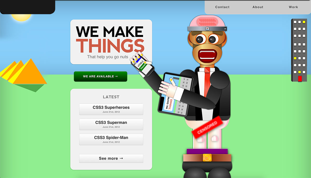
My whole site in pure CSS art (hero spots, all). A supposed representation of the less glamorous side of tech. Pretty much nobody noticed or cared. I didn’t like it, the quality is too low.

c. StumbleUpon Logo
This is still CSS>art. Stumbleupon team messages me (hi Mix). I choose SU because I can pull it off & they pretty much started “social media”.

d. Superheroes
I create Superman, Batman, Spider-Man, Hulk, Iron Man & Wolverine because I know everyone will get a kick out of div class=batman (nobody was doing that then). Pretty much everything is picked up by the brand new Codepen. Andy Clarke shares the superheroes & CSS Deck lights up. Nobody from that goes to my site/handles really.
They see several hundred thousand views across a bunch of places, links & compliments. Codepen asks “The first CSS cartoonist? Vuild has quite a style!“. They are not right, but understandable. I will add this quote to my homepage.

e. R2 D2 3D Illustrator Grade CSS Art
I focus on materials/reflections as I haven’t seen them before (this one used to have more to it, including animations & audio). Everyone was all “HTML5 & CSS3!” for a while.

f. Responsive Donkey Kong Game & Watch, Gameboy & Mini Classic in One
Responsive, illustrative, cross-browser, three games in one with working buttons. Indistinguishable from a Dribbble. Fully prefixed & tested like a real site. It takes longer than everything else combined. Codepen picks it up.

6. MacBook Pro
Joshua makes a Macbook Pro for 1/4M views (on Codepen alone via HN/YC). There is also another, bigger Mac. I can’t find it rn.
7. Enter the JS
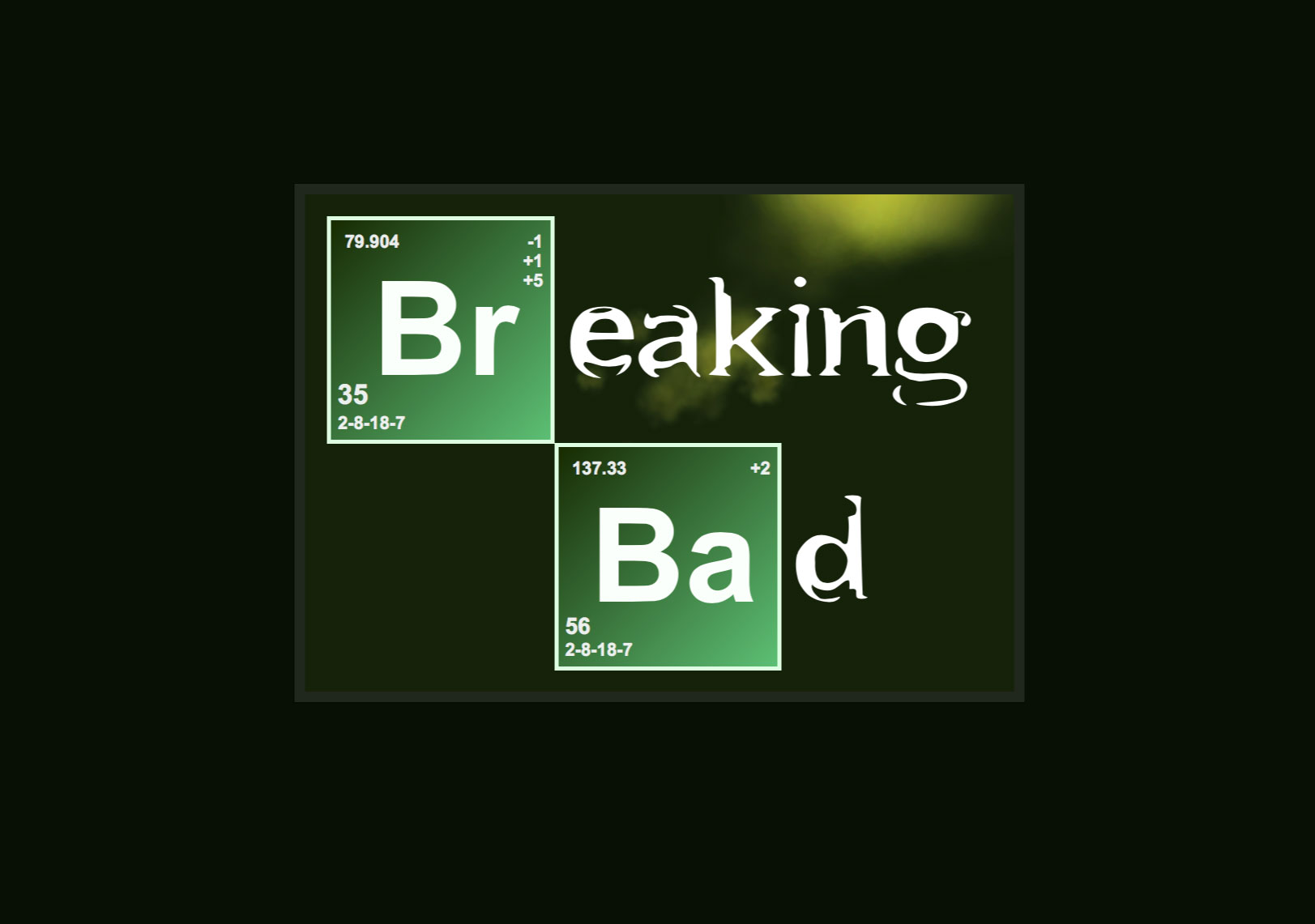
Tim smashes it out of the park with Breaking Bad (& others). Hugo, Bennett, Gerard, Jack (& others).
Lines are blurring. SVG/CSS/HTML/JS. Codepen picks any that have ‘something’ to them, but likes code/standards/usefulness more than ‘pictures’. My art-code is messy, -5 points. They check each pen I think.
I make a bunch more, don’t publish & decide to quit (in public). For 7 years.

8. Blank
The middle of 2012-2018. Space left intentionally blank for others. This tho. Feel free to fill in. More on this later.

9. Life Study
I come back in Apr 2018 with a working, realistic chronograph series: platinum, gold & white gold. Each one distinct, handcrafted, imperfect. Taken from live study + references. Reference 5170P is a Complication. I assume no-one has done real-life study CSS art yet. For Apple Watch, they studied the Swiss (French, British etc.) watch making techniques, including marketing & product.
Sidenote: If I could have any watch it would be this, slightly customized at build, until then I will wait. There are some nice Calatravas I would like, however reference 5170 is the one I like inside & out. Patek standards are exemplary & their staff flawless (even if they could tell). Pateks generally hold their value, but don’t use watches as an investment vehicle.
If you like watches then study the mechanism & part makers. I made some CSS Richard Mille & Rolex timepieces too, but I haven’t published them yet. One is Richard Mille rm-19-02 reference. It’s out there (you can see the workings under the dial, flower opening in CSS). Maybe one day I’ll show more. Watching the 5 million stages of a difficult watch build puts all CSS in perspective with respect to skills, knowledge & artistic ability. Making something that exists in a hundred years & is highly respected, not derided is cool.
10. Francine
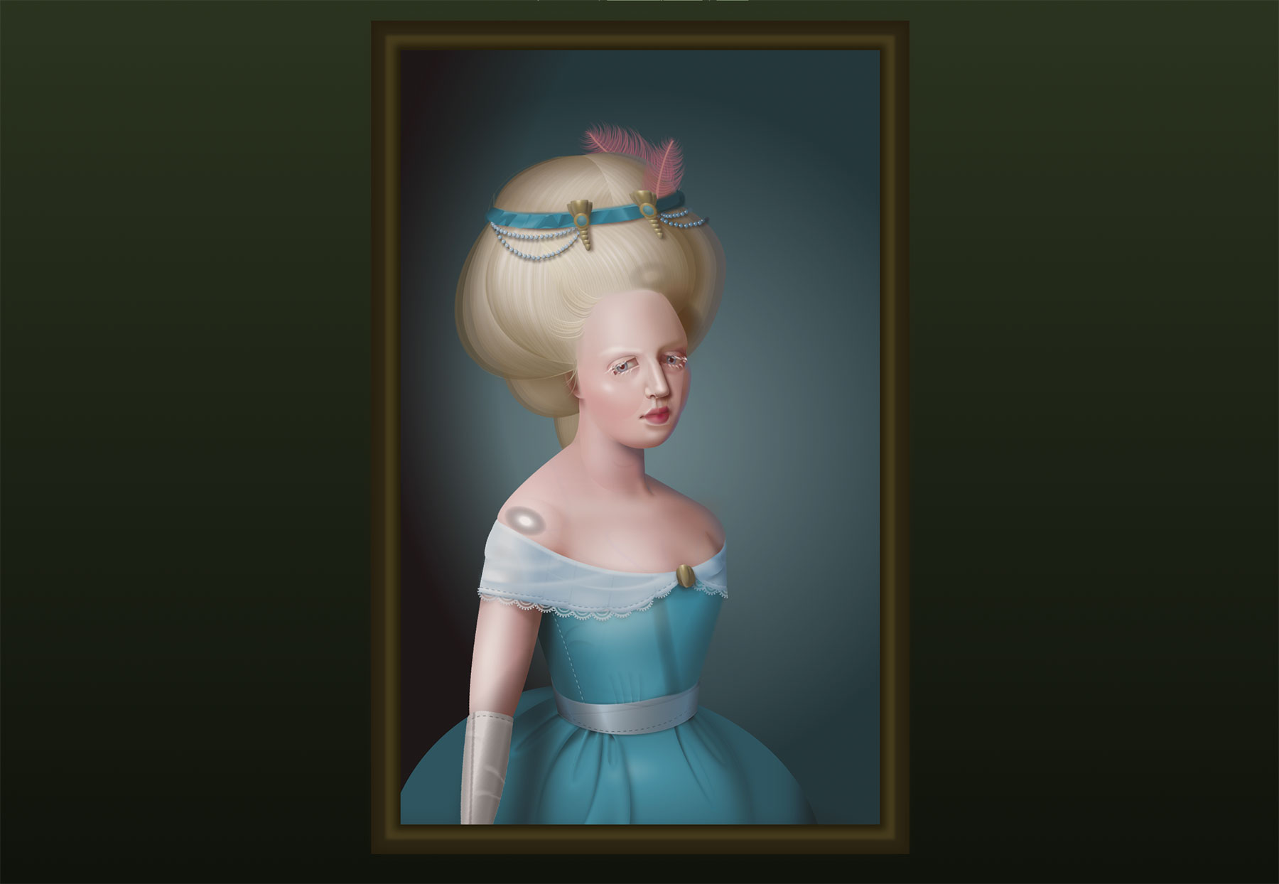
Diana smashes it out of the park with Francine (I made Tupac & other celebs/people in 2012). It’s the next level, the effort with lighting & composition take it far. Then to stylize it too? Certain parts of humans are extermely hard/time-consuming in CSS. This is the current standard. It should be working cross browser, but I wouldn’t want to do it. There is some question about the code but make no mistake, from a standing start to Francine is something else. My first goal was realistic human face. Zigaro & the fruit are also phenomenal. The next ones will be incredible.
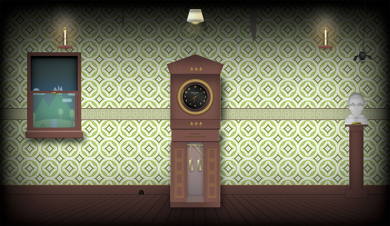
11. Grandfather* Clock
It doesnt look like much, but the statue head alone is CSS Batman (from above). The clock is the watches from above, it has a pseudo-3D floor, full screen, responsive, lots of different animation types, materials, textures, lighting, shadow, animated gradients, svg, emojis, js. As much as I could fit in to crash a new 2018MBP. It’s mine & I find it ugly.
*Technically it is a Grandmother clock I think.

12. Moustached Nanny
Julia delivers the most amazing animation & schools everyone. This is also the current standard. I don’t even look at the code. If she can make this, any scene can be done. Her work is delightful.
13. Parlor Tricks
As I can’t compete with Julia & Diana, I switch to parlor tricks & comedy. There is plenty more that others know, but that’s the bits I can remember.
Honorable Mention(s)
Honorable mention(s) to Adam Kuhn & Chris Gannon who do some crazy stuff. Much better & more useful than anything I made. Ana & many more. I don’t know where they fit in the timeline, but they are at it now. The stuff they do makes me feel old & past it.

14. Ben Evans
Ben. Evans. Remember it. First still life? Pure CSS Still Life – Water and Lemons. Transparency, refraction, wet-floor reflection, layers, light reflection, distortion. The only question really is did he stand in-front of it or was it from a photo?
Some Notes
There is a lot of debate about the value of CSS art. I started doing CSS art to get extra good/fast at layout & performance. I like bloated, hard to remember code because that’s what code you work on to find bugs is like. I set a tech target (gradients/clippaths/grid/RWD/etc.) & then choose an expression (object or idea) then I have to reach that target regardless. I am not “expressing” my artistic skill digitally, but I am following typical artistic process. I would use raster, svg, 3D for actually doing digital art. It’s to make me better at UI, which it does (z-index 9999999 !important = ?).
Artistically, it’s fun but a bit of a dead end beyond simple things. There are much more interesting ways to create art if that’s your thing. Waiting 24 months for bezier curves, extrusion, texture or whatever is too constraining. Saying that, you can do anything imaginable UI wise, so there will be lots more hybrid UI/art-ish things (glitter over jpgs, edges of content & UI blending). I am going the opposite direction, less CSS, less animation, more usability/ accessibility. This is actually what I always do, it’s what busy sites do.
Some Tips
I have been picked/shared/whatever on pretty much every piece I have put up (excl. variations/jokes) without being typecast. This is not by accident, it’s from studying. So this should help those doing it for exposure.
People will think you are as good as the thing they see, so drop something nice. Watch the trends/picks for a while first. As clickbait & a credibility booster CSS art works very well. It’s very easy too compared to most other things. Better than constant posting on social media. I have sent a few hundred thousand views to Codepen, [CSS Deck] & a bunch of others.
If you want exposure then take a little time, you can make a CSS (or JS) thing & drop it on Codepen (save & fill out the desc etc. then share somewhere so they can tell you want it public). You can quite easily see 500K-2M ‘impressions’ in a couple of days if you can get it to jump to CSS Tricks, Reddit, etc. If you optimize titles, point some anchors at it, you can SERP jack too. Pub on your own site first to take second spot as well.
It’s much more effective marketing than this post, however, it doesn’t pay bills. There are plenty of coders out there struggling but time wasting on 3rd parties. Sites like Codepen should give stuff to content providers, rather than ask more or dark pattern their best people. The revenue source should be businesses, not your performers. There is no “you” in “sharing” economy. It is classic micro neo-feudalism in buddy masks.
I don’t really put much there as it is entirely editorial & not a meritocracy. Paid home placement distorts my perception of the quality of my ideas. It’s why no one used Yahoo paid SERPs. This is not an attack, it is a mindset (on all sides) & necessary due to the nature of it’s architecture. I will go in-depth on this stuff, but maybe on video as it’s quicker & clearer. Adding Pro badges next to people who pay says more about the service than the “Pro”.
In general, like much of West Coast tech, they (any online service) take 95% of the value from you while paying little or nothing. Their rules, their place, they own your stuff to use at will. Feedback is another content engine. Not me, they come to me, pay my team’s wages & I post on my properties mostly. It is not a criticism, these services can be used to make a fortune too. You should use them how you like. I use it to timestamp. It will all reveal over time. Each pen always had 5 different things to pay attention to.
I generally recommend only giving some of your value away, lest you contribute to the next privacy & data villain (don’t worry, I’ll be addressing this – like all good stories we are in the early long-exploration stage & setting the scene).
Exclusivity, holding something back, going slow, planning, preparation & valuing your {even non} customer are all opposites to the Baytech (+WA. OR. CA. NY.) “ask forgiveness afterwards” mindset. Companies like Patek exist for so long by doing the opposite. History is already watching, it has been for a while.
Your info will only be used for comments. No Gmail.